Styling a Rental Space
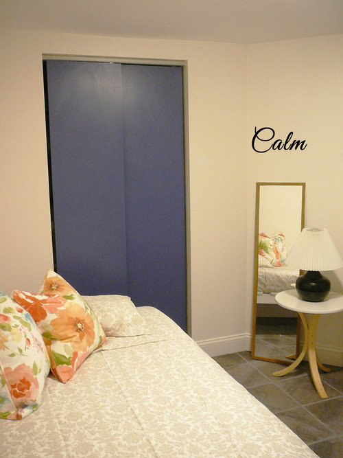
I’m very excited to share the styling progress on this apartment! It’s been a LONG process as we had contractors working in the space, unfinished areas all over, and so many plans - and furniture hunting - to complete the decor. First thing we took care of was the rental space: calm bedroom + sitting / lounge area with a private entrance. You can see some before pictures in my previous post :)
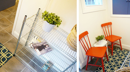
Look at this welcoming space! I wanted it to be calm, bright and happy as the ideal tenant is a young professional lady. Because it’s a small area in a shared apartment it was important to set up different areas and take advantage of all the space. Narrow pieces of furniture and bright colors help bringing the light inside the bedroom. And a pretty rug marks a chic and practical sitting area outside. Ain’t it cute?
When styling a rental space, it’s important to leave plenty of room for the tenant to decorate it as she wants. Ideally it will have the potential to welcome any style and personality. So, I always recommend to avoid clutter, specially hanging pictures on the walls - I find that to be a very personal decision. On the contrary, try to leave empty walls and shelves for creation.
I’m loving this small hanging out area. These chairs were and immediate crush, even though I’m usually scared of using reds in the decor. It feels perfect for sharing a glass of wine with a friend or enjoying a Sunday morning coffee. Would you use bold colors in your furniture too?
I’m very happy with the results and so is my client! :) This little but practical space is looking much more cozy and personalized now; and I can’t wait to share pictures of the whole apartment with you! Hope you like it. xo.


